Lessons from Miami Retail (and yes, they apply to you)
Since spending more time-based in Miami, (the Design District is my home neighborhood) I’ve seen brands at their most experimental, invested, effective, and ineffective. All on a day-to-day basis.
I’ve learned that my online retail experience is incredibly helpful for even nonprofit clients seeking to penetrate perception and move a needle. So too is Miami’s innovative, out-there, and ever-evolving brick-and-mortar shopping district incredibly instructive for emerging and other mainly online brands.
Here’s what I mean.
Always change the window. Miami loves a window change. Any time I walk by a window and see the same display, I assume there's nothing new in the store. And vice versa. It’s so basic, it’s so easy, and I’m always so surprised how many people get it wrong. I poke in on the sites of clients I’ve worked with, and find the homepage is the same since we last worked together! The homepage and landing pages are your store windows for key audiences. For a nonprofit, this is a “credibility” display that says – yes, we know what’s up, we’re paying attention, we’re nimble. Change the headlines. Change the images. Or we’re all thinking - eh, nothing new there.
And don’t put it in the window if you don’t have it for sale. (Or do, but with intention.) I saw a pair of shoes in a window recently and when I walked in and asked about them, they told me they were runway only and not available. It was my first time being interested in this brand, and when they didn’t have what caught my eye, it broke the pathway to action they were taking me down, and I wouldn’t be inclined to try again. If you run an ad, make sure it drives right to purchase anything you’re showing there. If you’re eliciting a donation or other action, don’t just look at what you’re using to elicit it, but the entire chain – the landing page and beyond - through to the action you want people to take.
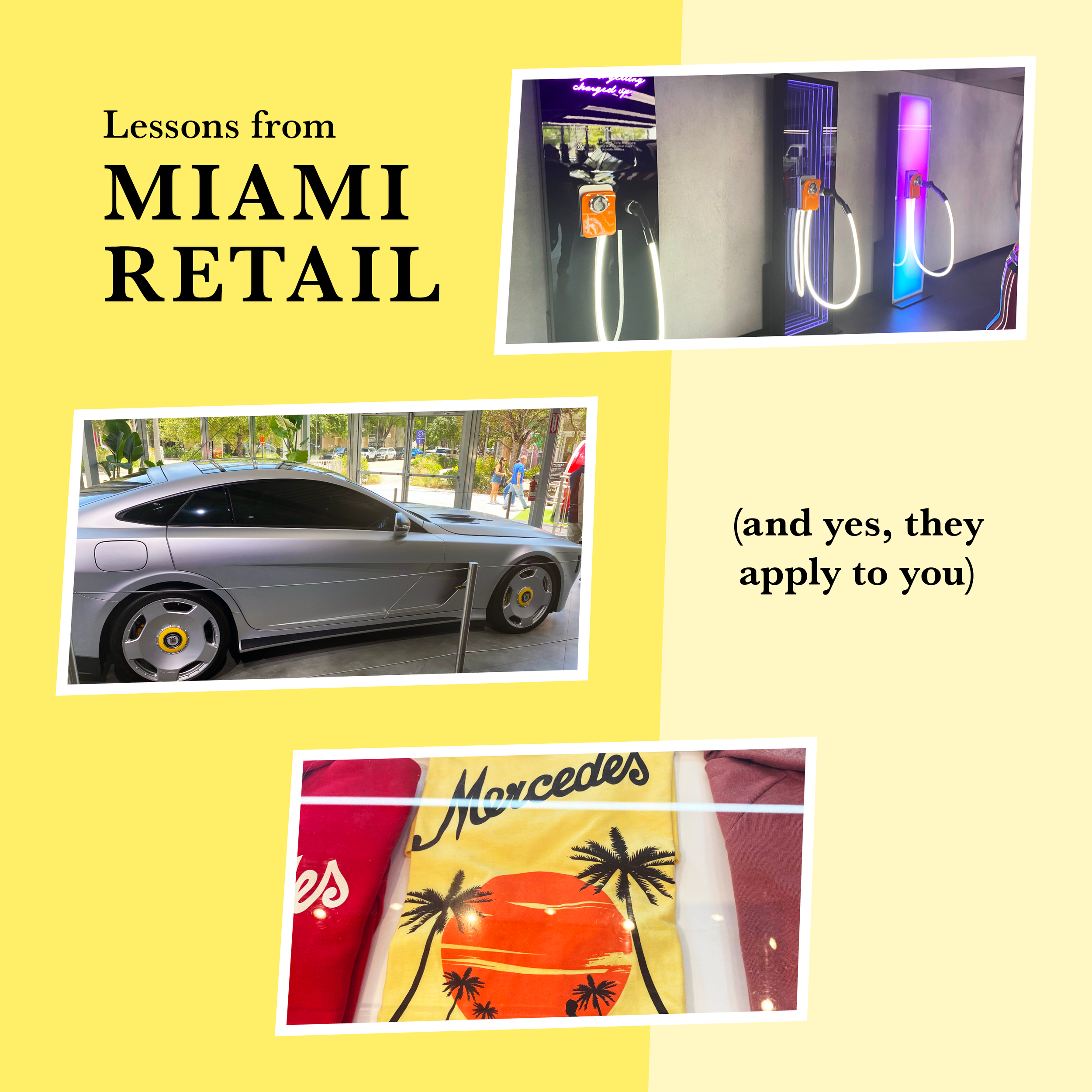
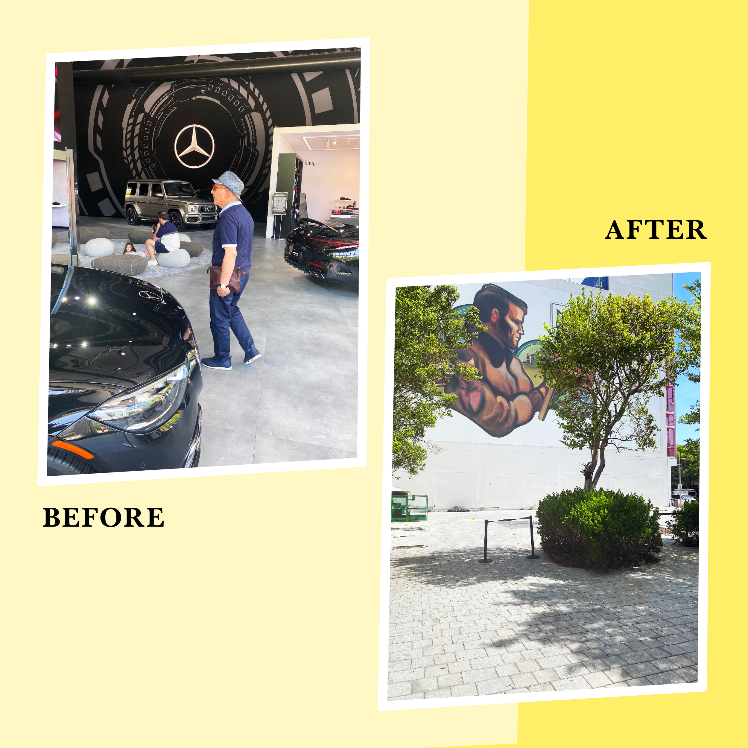
The fish are bigger than you think. Create a smaller pond. Here, you really see the might of the brands you love. From a fully branded Fendi cafe erected for months to a giant Mercedes store created to align with the Formula 1 racing event and taken down beam by beam when it ended. You see in stark relief just how much the brands we already know and love put into maintaining that status in consumers' hearts and minds. I had a brand I really wanted to work with because I liked the product and the person behind it a lot, but they had a really small budget. And we diverged on how to spend it. They’d see and want to pick off all sorts of opportunities. But to me, a scattered approach is a waste; I really wanted them to take a moment and consider where they’d get the most bang for their buck, radiating out from where the founder lives with a smart, targeted effort. Can you imagine dropping in here where there’s a SKIMS pop-up, red carpets, Housewives appearances, etc, and trying to get seen and remembered?
People love to browse. The browsing in the Design District is epic. People dress up and wait in lines just to browse and take pictures of themselves in stores, in front of the store, and holding merchandise. Browsing is good! Browsing is the gateway. Oftentimes, it’s the thought that you’re going to “just browse” that allows you to go inside and ultimately leads you to buy. So make it easy and delightful for a stakeholder to browse. Include a “shop all” as well as some engaging, of-the-moment digital shops within shops. And curate collections with a price mix that entices a browser to go ahead and convert (like, “ok I guess I can do the sunglasses”). For a nonprofit it’s offering lots of ways and amounts to donate and what they can do for your org (something emotional and palpable). For a professional services business, it’s offering testimonials and results to browse and branding a free first contact/audit/consult. I’d love to A/B test “shop all” versus “browse” on a nav and as an email button. My instinct tells me that the seemingly lower stakes of browsing is less of a barrier to entry.
Be warm to your customer. Sounds obvious. Surprisingly isn’t. The sales assistants in Miami see oddities all day long. But they want to make sales. So they’re warm! They engage! They complement a particular part of your outfit. They offer you water. Or wine. And because they’re so kind, it’s harder to leave empty-handed! Yet too often we don’t do the equivalent online. When I was part of launching Rue La La, I made a big deal that the language, just because it’s digital, shouldn't be robotic. I still find the same thing during site audits today. A category landing page, for example, should be warm and inviting. You searched for something, and we don’t just toss it all on the ground (or the page) in front of you. A little text goes a long way to setting up the experience and has an SEO impact to boot.
Be smart about your offseason. Here, everything crucial to the business gets done in time for the start of the season. And as soon as the off-season starts, retailers dig right in to the longer term work that will make a big impact on launch. New stores are being built. Planning starts now for the huge scale popups that will garner attention in high season. In summer, gather a few key players to dig into holiday (or holiday giving for nonprofits). In slower months for giving, when high-end donors retreat to summer homes, make site upgrades that make giving easier. Look at your succession plans. Use low seasons to A/B test, experiment with new sharing initiatives, and talk to customers/stakeholders.


