Brand DNA x Illustration
When we talk about Brand DNA, we’re talking about making your brand stand out in a way that creates true loyalty, shareability, and emotion. Brands need clarity, distinction, & authenticity. It’s so easy to get confused by branding. To immediately click away.
Out of all the someone can choose from, your needs enough firepower
to stand out.
Your brand is more than just what people see when they search you. It’s a visual and voice identity that resonates deeply with your market. One you carefully develop and then steward across every single channel. One that resonates with customers, makes them care about the product, and are motivated by the branding. It’s got a certain magic.
Illustration can be a really powerful addition to your Brand DNA. Having a visual language enables you to inject new creative thinking, and stronger brand alignment/presence in your creative. Once you’ve established an illustration style for your brand, it's easy for you to expand your illustration library.
We spoke to two of our talented creatives about their work establishing illustrations to enhance clients branding.
Lily Xiao
Illustrator, Lily Xiao, developed her unique Illustration style through failure—yes, this sounds harsh but it's true! She says that art making is so expressive and personal to her. Her style has developed after much reflection on what she is attracted to, why she is attracted to it, and is heavily influenced by elements of nostalgia. Summer days by the pool, trampolines, rollerblades, and beach bonfires. Early 2000’s anime & Sunday morning cartoons.
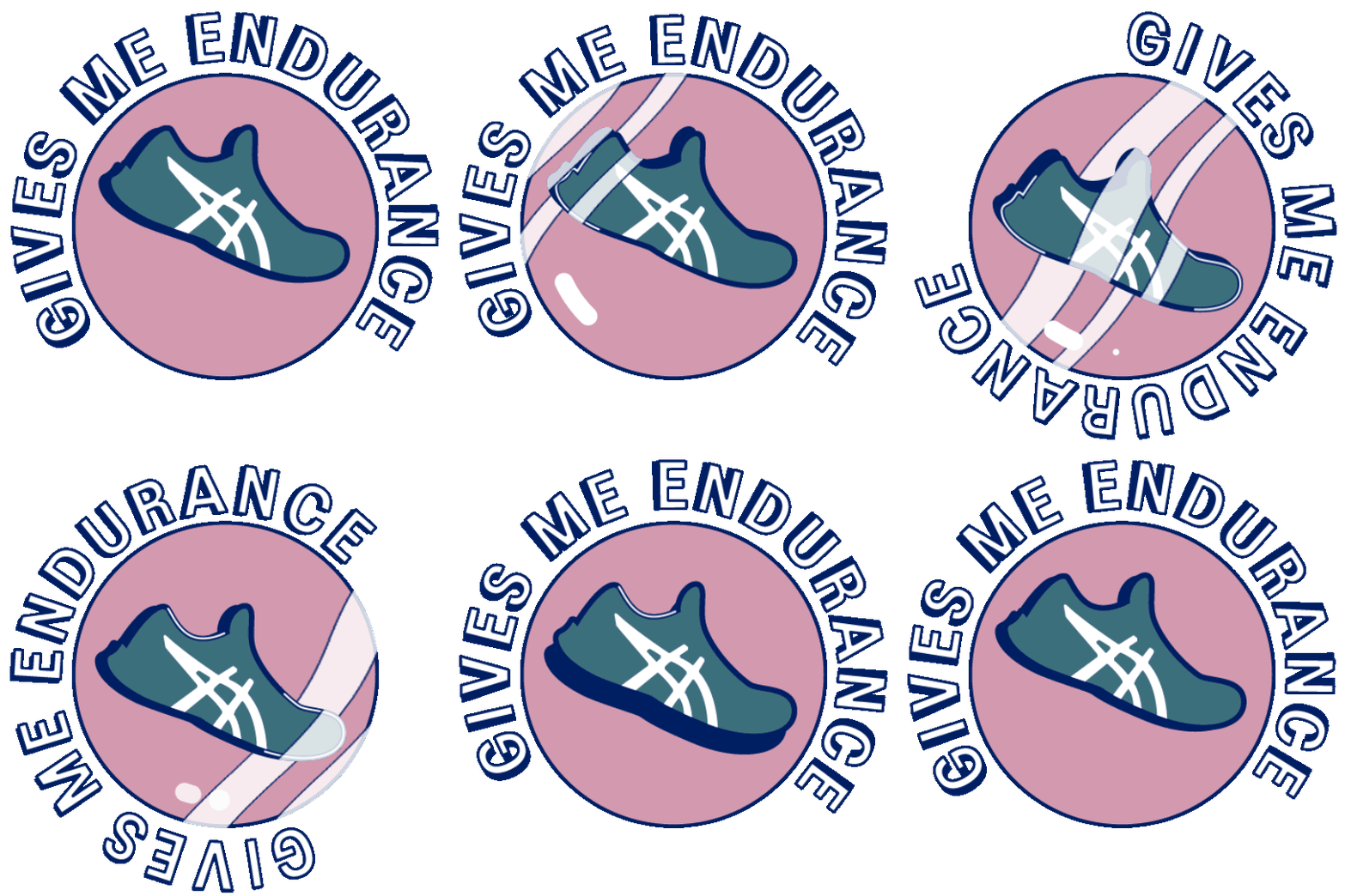
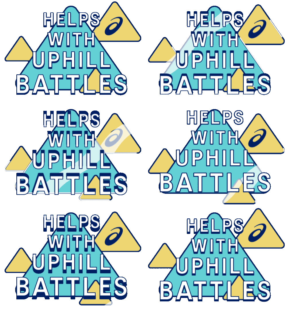
One really unique project that Lily worked on with us is a series of Instagram stickers for our client ASICS. Her approach to the project? Just as mental as it was physical. She said, “Once I had the vision in my head and discussed it with the team, I didn’t let doubt creep in—even though it was there. My creative director, Kacie McLean along with Susanne and Rachel displayed a lot of trust in my abilities which bolstered my confidence. They're definitely the ‘dream team’ you want guiding you on one of your first big freelance jobs.”
For hands-on prep, Lily came up with the concepts first and discussed what emotions and messages we wanted to convey. ASICS interviewed a handful of inspiring runners and gave us their stories to base the art on. Then, she planned out how to translate those feelings into motion graphics using design, colors, and animation.
Stickers are playful and add a little whimsy. In the digital world, they’re similar to emojis, conveying feelings and emotions in place of words. In a way, stickers have evolved to add to our roster of communication.
In today's digital landscape, brands will find a lot of value in offering their customers custom illustration and sticker packs. Stickers offer a chance for your customer to express themselves by saying “I like x, y, z and therefore I’m x, y, z type of person.” They’re interactive, engaging, and fun. Visually, digital stickers add to a company's overall look and style. Most importantly, they help connect customers emotionally to a brand.
Paul Johnson
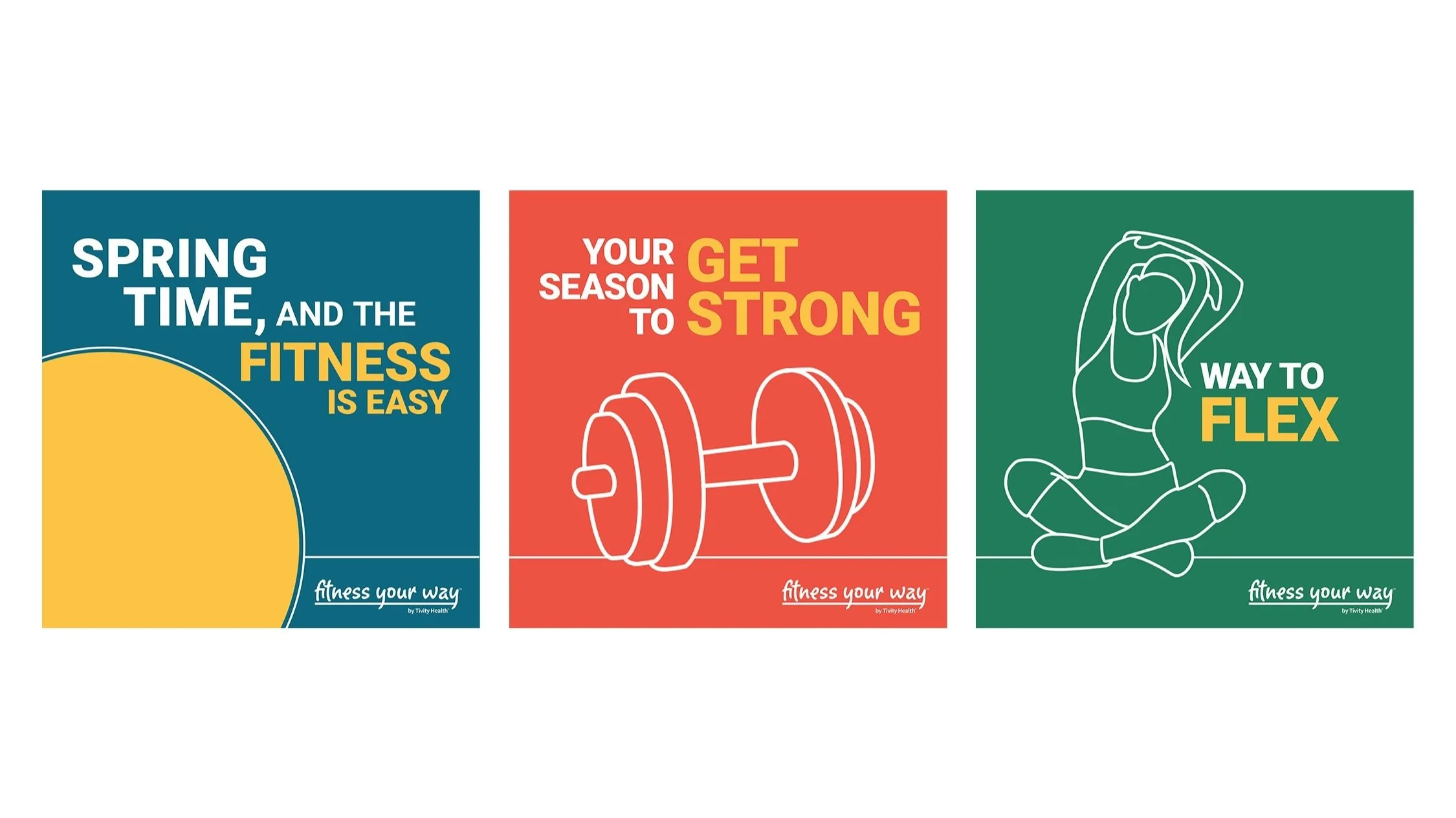
Creative Director, Paul Johnson, worked with HCC client, Tivity Health to freshen up their flyers and social posts for their partnership with Blue Cross and Blue Shield. He created new light, hand drawn visuals of people working out as an engaging visual treatment to bring a human connection to the work. The beauty of line art is that we can all see ourselves as this figure, whereas using photography of an actual person can sometimes not allow the viewer to identify quite as strongly. By bringing in the Tivity brand colors into the design and creating a system around we dramatically increased the Tivity brand in all of the creative.


